Okay, so it didn't really crash but I'm having some technical difficulties with my computers. My main computer has caught some spyware, which I identified by poor spelling, and refuses to load into safe mode. Thus, I have retreated across the hall to my 12 (give or take) year old computer and 13 year old keyboard (it has a macro key, the D, C, V, and K are totally faded and it has that fat, ugly enter key).
So, uhh... I had pictures on my camera of my media tool use, but that won't do any good now because I'm betting if I tried to hook more than two USB into this computer, it would die a painful, screaming death. :(
EDIT: Safe mode has finally run! Only the 8th try, too! 'Lo and behold, I have at least one trojan and a few swarms of spyware. So I guess I'll be off to watch Simpsons...
Sunday, September 23, 2007
Assignment Three: Website Structure Maps 3/3
Wolfhome is a graphical chat site where everyone's avatar is a free graphic of a poorly shaded little wolf in a colour of each person's choice; by default, these colours are black, grey, brown, and yellow but they can be customized after registration.
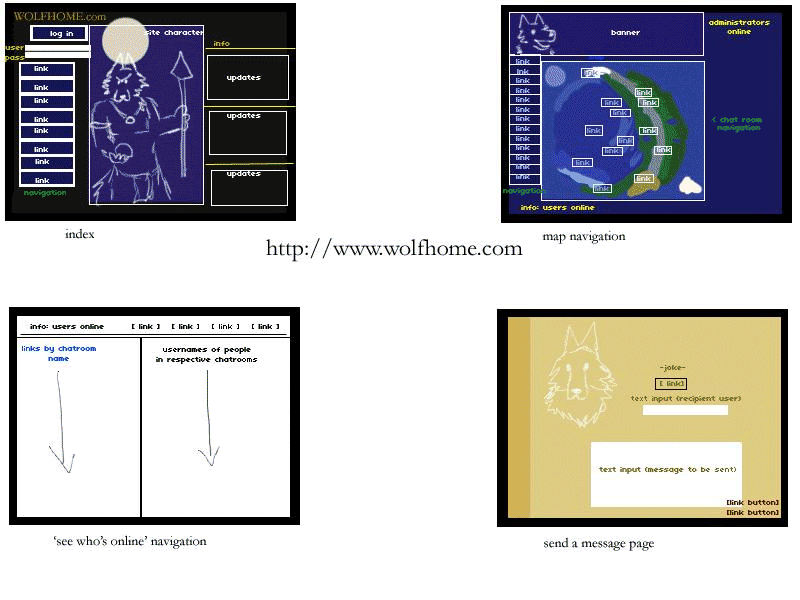
Sorry for colour drainage. GIF = death. I will start off by saying that, unlike the other two sites in this assignment, Wolfhome has absolutely no consistency and will more than likely lose a first time user in navigation. To be fair, this site was designed and released in 1999 when, apparently, people failed at page-by-page navigation. Every page for itself? Anyway, Wolfhome takes advantage of dark colours most of the time. Navy is the preferred background colour on most pages. Yellow is the colour for all important texts, links are blue, most other text is black on white or white on black/dark blue.
The first panel shows the index page which has the title, a login prompt, some short navigational links that won't actually get you anywhere but the forums unless you're logged in, the "guardian" (wolf in a loin cloth) image, and beside him, a small updates box. Above the updates is a statement of how many users are currently online chatting.
The second panel shows the "world map", which still looks decently consistent. I was not sure whether I should or shouldn't call the bar on the left side a navigational bar because other navigational links are scattered all over the screen. Basically the navigational links on the left side link out-of-chat and to modifying personal information, and some lead to dead links (due to a site crash, some pages have not been recovered yet). On the map itself are various links positioned by what I believe to be 'div' boxes on certain parts of the image. By clicking these, users enter chat rooms. On the top of the page, there is a banner that says the name Wolfhome and shows the head of the "guardian". Beside the banner in yellow, it shows the administrators currently online in case anyone needs to "howl" them for help. (The option is also available in-chat, though that is an absolutely different interface.)
In the third panel, we see what is known as the "mysts". It is a page for users to view the chat rooms that are occupied and see who is in them. It is plain white with some links at the top. Under a black horizontal bar, the left side has in blue text and hyperlink the names of the chat rooms. On the right side on black text, the alias' of the users in those rooms are displayed. If there is no one in a room, the right side is left blank.
Finally, the last panel contains the "send a message" page where users are able to leave a message for another user to see upon login, and then never again (it is not told by the site to be cached or saved, and does not offer the option). It has almost nothing to do with the other colour schemes or plain appearance with its beige background and side bar. The only consistency with this page is the "guardian" head again. There is a blank text input field to fill in the recipient's name, the message, and then two buttons to send the message or to return to the map view.
For the past seven years, I had been using Wolfhome without thought, but looking at its layout, it is difficult to understand how people are so drawn to such a poorly navigated community.
Assignment Three: Website Structure Maps 2/3
Parrotdise Perch is a small online Canadian parrot toy, food, and supply retailer. A combination of warm colours, reds and oranges, mix to create a sunset (or sun conure?) effect on a white background. Text colours are explored, but confine mostly to black on white. The navigation is incredibly consistent and easy to navigate wherever you are on the site.
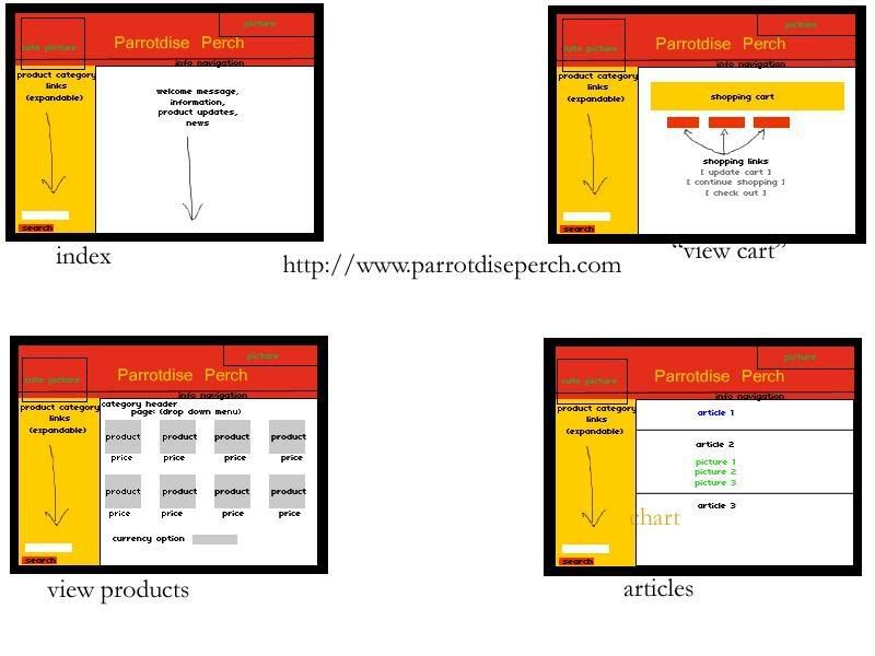
As you can see, the same top banner with the name and two images, plus the navigational side bar follow everywhere on the site. Clearly there is a good use of frames to control what navigates where, and everything revolves around the changing centre (white) block to display content. There is a small bar with informational navigational links below the banner favouring the right side. It contains simple information about the company, shipping, links, articles, and cart option. The product navigation on the left side contains various links to different categories of products, like food, toys, toy parts, essentials, caging, and so on. These links are expandable and open a larger menu beneath the original links to narrow down a product type based on size, brand, material composition, or use. Under the entire product navigation is a search bar for people who know exactly what they are looking for by name or product code.
On the index page, the white square shows news updates, new products, and advertises contests or offers the company is holding.
In the second panel, there is an orange box that shows the products a user has placed in their cart. Accompanied by the name is a small thumbnail image with a link to that product's page, the price, quantity, and the product code. Underneath all of the products would be a total of all the costs. Under the orange box, three red buttons direct a user to refresh their cart to see new changes, continue shopping on-site, or check out and continue to pay three optional ways.
The third panel shows the product view. By clicking on any category or subcategory along the product navigation bar or searching any broad item, a page appears with two rows of four products. Pictures are shown along with the product name and price underneath. On the top of the white frame is a drop down menu for a user to choose a page number to look through, if in fact there are multiple pages of products. On the bottom of the white frame is another drop down menu that allows people to choose the currency they would like product prices to be displayed in (US or CAD).
Finally, the fourth panel shows the articles written by or publicized by the site. Each article is separated by a frame-wide black horizontal line, and sometimes the articles will contain different colours as a part of differentiation (ie. blue title).
Assignment Three: Website Structure Maps 1/3
(I have no idea if I did this right)
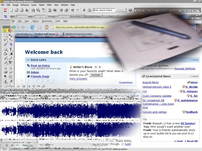
LiveJournal
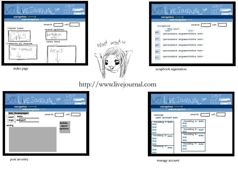
LiveJournal is a blogging site, much like Blogger, but much, much better. It actually provides multiple layouts for users to choose from, and the one I've chosen from is quite an old layout, but easy to navigate and use.

The colour scheme is a soft blue mixture on white with simple black-on-white text in most areas. Links are a generic blue and sans-serif fonts usually match the site best (though it is configured to follow your browser font settings).
Poised on the top of the page is our lovely LiveJournal banner that is consistent as we move along the site. This banner carries the logo, the name, and a sign in option with boxes for username and password. If one is already logged in, their display picture will be shown along with their username and the little dude that represents LiveJournal users. Below the banner, there is a long strip of site navigation that also follows you as you move about the site. By hovering over single words, more navigational options appear to click on. The links that appear as a result of hovering are simply some more specific pages than the vague words being hovered over (things like 'recent', 'friends', 'info', etc.). Another useful tool that follows users around the site is a search bar where one may enter a typed query and choose a category to search in, such as usernames, region, interest, and so on.
The index page of LiveJournal has various undefined boxes for its text. Everything is organized under a heading and often contains links and updates on a personal journal, links of interest, or news feeds from the statistics update journal of the administrators.
LiveJournal also offers a scrapbook tool that is available for paying users or users who open their journal up to paid advertising. For unregistered users, it appears as a page explaining the wicked cool details of scrapbook in hopes of persuading people to pay. The arguments are under their own headings with a relevant, simple generic image.
The third panel is LiveJournal's "update" page for users to update their personal blogs. Users' icons are shown on the left side of the page and do not exceed 100 x 100 pixels. Similarly to Blogger, there is a subject line and a few lines indicating the date and time at which the entry is posted. Users may modify this and backdate entries, as well. There is a large box for the entry to go in, and on the right side, LiveJournal advertises the ability to update from mobile phones through text and voice, downloadable clients, and other neat conveniences. Below the entry are more optional forms to type the location one is updating from, music listening to, and mood. Mood is accompanied by a set mood theme of little characters the users choose.
Finally, the last panel shows the general page for managing a LiveJournal account. There are several headings that revolve around friends, personal information, journal appearance, display icons, mood themes, etc. that lead to more specific pages.
Some of the pages are a bit cluttered, but everything on them is relevant and the loading time is very short because the graphics are simple and nothing is over-emphasized or made to look totally eccentric.
LiveJournal is a blogging site, much like Blogger, but much, much better. It actually provides multiple layouts for users to choose from, and the one I've chosen from is quite an old layout, but easy to navigate and use.
The colour scheme is a soft blue mixture on white with simple black-on-white text in most areas. Links are a generic blue and sans-serif fonts usually match the site best (though it is configured to follow your browser font settings).
Poised on the top of the page is our lovely LiveJournal banner that is consistent as we move along the site. This banner carries the logo, the name, and a sign in option with boxes for username and password. If one is already logged in, their display picture will be shown along with their username and the little dude that represents LiveJournal users. Below the banner, there is a long strip of site navigation that also follows you as you move about the site. By hovering over single words, more navigational options appear to click on. The links that appear as a result of hovering are simply some more specific pages than the vague words being hovered over (things like 'recent', 'friends', 'info', etc.). Another useful tool that follows users around the site is a search bar where one may enter a typed query and choose a category to search in, such as usernames, region, interest, and so on.
The index page of LiveJournal has various undefined boxes for its text. Everything is organized under a heading and often contains links and updates on a personal journal, links of interest, or news feeds from the statistics update journal of the administrators.
LiveJournal also offers a scrapbook tool that is available for paying users or users who open their journal up to paid advertising. For unregistered users, it appears as a page explaining the wicked cool details of scrapbook in hopes of persuading people to pay. The arguments are under their own headings with a relevant, simple generic image.
The third panel is LiveJournal's "update" page for users to update their personal blogs. Users' icons are shown on the left side of the page and do not exceed 100 x 100 pixels. Similarly to Blogger, there is a subject line and a few lines indicating the date and time at which the entry is posted. Users may modify this and backdate entries, as well. There is a large box for the entry to go in, and on the right side, LiveJournal advertises the ability to update from mobile phones through text and voice, downloadable clients, and other neat conveniences. Below the entry are more optional forms to type the location one is updating from, music listening to, and mood. Mood is accompanied by a set mood theme of little characters the users choose.
Finally, the last panel shows the general page for managing a LiveJournal account. There are several headings that revolve around friends, personal information, journal appearance, display icons, mood themes, etc. that lead to more specific pages.
Some of the pages are a bit cluttered, but everything on them is relevant and the loading time is very short because the graphics are simple and nothing is over-emphasized or made to look totally eccentric.
Monday, September 17, 2007
Friday, September 14, 2007
Technology Assessment
And so the time has come for me to vent my frustration on the tablet I love so dearly and have used for the past two days (and the last five or more years, but silly numbers aside...).
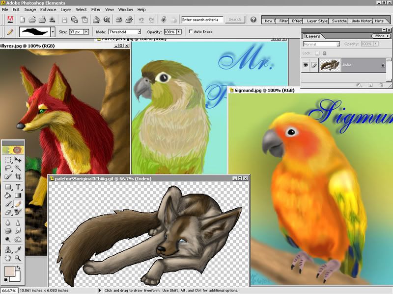
I chose to evaluate a media tool I use on a daily basis, and decided on my small Wacom Graphire 4"x5" tablet. The level of works I normally create with a tablet (using another media tool, Adobe Photoshop Elements 2.0) between ten minutes and two hours resembles something of this nature:
 (click for full size)
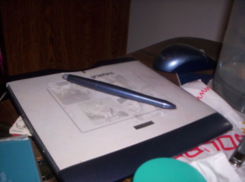 (click for full size)
Often times, I encounter no problems while drawing or using the tablet pen as a mouse while, say, my regular mouse is recharging.
I use my tablet whenever I draw, usually in the afternoons and evenings between 4:00PM and 1:00AM the following morning, but not every single day. For the past two days, I had used it once in the evening for about two hours and once in the morning for about an hour and a half.
Using a tablet requires good motor skills and a good visual connection between the control of one's hands and eyes. Because traditional drawing (besides blind contour art and other blind varieties) requires the artist to look at the surface on which they are drawing, the move from paper to tablet can be confusing and artists need time to adjust to the change.
Problem #1: Sensitivity, opacity. I believe that with age, and given the age of this model alone, the sensitivity of the pen to tablet has faded. Photoshop is usually wonderful at picking up on my pressures and applying them as opacities, but I've noticed recently it has not been performing as realistically as it once did.
Problem #2: Small brush adjusting button on the side of the pen. Because I hold my pens and pencils naturally low, I do the same with the tablet pen. I almost always hit the small grey button along the side of my pen while I am doing art, which then changes the type of brush, the opacity, and the overall effect of my movements. This is one of my biggest and only issues with the tablet, and most Wacom tablets.
Besides this, and my own laziness allowing the surface of the tablet to get dusty, I really have no issues with it. I love my tablet. :)
Thursday, September 13, 2007
Day 2 - Technological Assessment
My lovely little tablet has no flaws. I don't know if that's a good thing or a bad thing, because I work with it all the time and it causes no problems, yet I have nothing to write about it in my frustrations save for a minor inconvenience... Maybe I'll come up with something tomorrooooowwwwww...
Wednesday, September 12, 2007
Day 1 - Technological Assessment
For the past hour and a half, I have been tweaking around with my tablet. It's a lovely little Wacom Graphire 4"x5" tablet. By today's standards, it's tiny, it's weak, it's horribly cheap, and kind of lame. But I love it, and for the record, received it as a gift before tablets were cool and widely sold on the market, especially in sizes much larger. ;)
It moves fairly well, but if I twitch or jump or something, my pen is always touching the tablet, so it acts as a mouse and shifts whatever I was hovering over. So far, so good. It has served me well thus far in creating small digital portraits and so far today, has had no malfunctions.
It moves fairly well, but if I twitch or jump or something, my pen is always touching the tablet, so it acts as a mouse and shifts whatever I was hovering over. So far, so good. It has served me well thus far in creating small digital portraits and so far today, has had no malfunctions.
Tuesday, September 11, 2007
Media tool use
To be absolutely honest, the technologies and interfaces I use everyday are very convenient. I've really grown to use them without difficulty. I mean, sometimes my camera craps out on me in quality, but that could have been avoided because I've dropped it. Even MSN works well for me, keeps me signed in, doesn't lag... My technological world is full of conveniences thus far.
Monday, September 10, 2007
Media tools
I use a ton of media tools, but those I use most frequently would be:
- Blogger/LiveJournal
- Web CT
- Adobe Photoshop/Paint Shop Pro/PSP Animation Shop
- MSN
- Microsoft Word
- Microsoft Paint
- Firefox
- Winamp
- Java
- Peer-to-peer programs like BitTorrent and Limewire
- Mouse
- Keyboard
- Scanner/printer/copier
- Digital camera
- Tablet
- Speakers
- Monitor
- Synthesizer and/or piano (okay, so it's not hooked up to the computer now or much at all; nor is it used every single day, but it's a really fun media tool regardless when it is used)
Subscribe to:
Posts (Atom)