Parrotdise Perch is a small online Canadian parrot toy, food, and supply retailer. A combination of warm colours, reds and oranges, mix to create a sunset (or sun conure?) effect on a white background. Text colours are explored, but confine mostly to black on white. The navigation is incredibly consistent and easy to navigate wherever you are on the site.
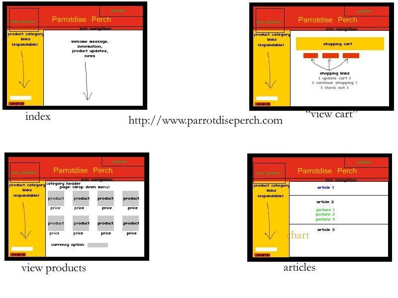
As you can see, the same top banner with the name and two images, plus the navigational side bar follow everywhere on the site. Clearly there is a good use of frames to control what navigates where, and everything revolves around the changing centre (white) block to display content. There is a small bar with informational navigational links below the banner favouring the right side. It contains simple information about the company, shipping, links, articles, and cart option. The product navigation on the left side contains various links to different categories of products, like food, toys, toy parts, essentials, caging, and so on. These links are expandable and open a larger menu beneath the original links to narrow down a product type based on size, brand, material composition, or use. Under the entire product navigation is a search bar for people who know exactly what they are looking for by name or product code.
On the index page, the white square shows news updates, new products, and advertises contests or offers the company is holding.
In the second panel, there is an orange box that shows the products a user has placed in their cart. Accompanied by the name is a small thumbnail image with a link to that product's page, the price, quantity, and the product code. Underneath all of the products would be a total of all the costs. Under the orange box, three red buttons direct a user to refresh their cart to see new changes, continue shopping on-site, or check out and continue to pay three optional ways.
The third panel shows the product view. By clicking on any category or subcategory along the product navigation bar or searching any broad item, a page appears with two rows of four products. Pictures are shown along with the product name and price underneath. On the top of the white frame is a drop down menu for a user to choose a page number to look through, if in fact there are multiple pages of products. On the bottom of the white frame is another drop down menu that allows people to choose the currency they would like product prices to be displayed in (US or CAD).
Finally, the fourth panel shows the articles written by or publicized by the site. Each article is separated by a frame-wide black horizontal line, and sometimes the articles will contain different colours as a part of differentiation (ie. blue title).
No comments:
Post a Comment