LiveJournal is a blogging site, much like Blogger, but much, much better. It actually provides multiple layouts for users to choose from, and the one I've chosen from is quite an old layout, but easy to navigate and use.
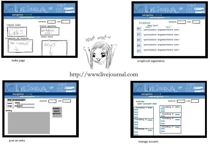
The colour scheme is a soft blue mixture on white with simple black-on-white text in most areas. Links are a generic blue and sans-serif fonts usually match the site best (though it is configured to follow your browser font settings).
Poised on the top of the page is our lovely LiveJournal banner that is consistent as we move along the site. This banner carries the logo, the name, and a sign in option with boxes for username and password. If one is already logged in, their display picture will be shown along with their username and the little dude that represents LiveJournal users. Below the banner, there is a long strip of site navigation that also follows you as you move about the site. By hovering over single words, more navigational options appear to click on. The links that appear as a result of hovering are simply some more specific pages than the vague words being hovered over (things like 'recent', 'friends', 'info', etc.). Another useful tool that follows users around the site is a search bar where one may enter a typed query and choose a category to search in, such as usernames, region, interest, and so on.
The index page of LiveJournal has various undefined boxes for its text. Everything is organized under a heading and often contains links and updates on a personal journal, links of interest, or news feeds from the statistics update journal of the administrators.
LiveJournal also offers a scrapbook tool that is available for paying users or users who open their journal up to paid advertising. For unregistered users, it appears as a page explaining the wicked cool details of scrapbook in hopes of persuading people to pay. The arguments are under their own headings with a relevant, simple generic image.
The third panel is LiveJournal's "update" page for users to update their personal blogs. Users' icons are shown on the left side of the page and do not exceed 100 x 100 pixels. Similarly to Blogger, there is a subject line and a few lines indicating the date and time at which the entry is posted. Users may modify this and backdate entries, as well. There is a large box for the entry to go in, and on the right side, LiveJournal advertises the ability to update from mobile phones through text and voice, downloadable clients, and other neat conveniences. Below the entry are more optional forms to type the location one is updating from, music listening to, and mood. Mood is accompanied by a set mood theme of little characters the users choose.
Finally, the last panel shows the general page for managing a LiveJournal account. There are several headings that revolve around friends, personal information, journal appearance, display icons, mood themes, etc. that lead to more specific pages.
Some of the pages are a bit cluttered, but everything on them is relevant and the loading time is very short because the graphics are simple and nothing is over-emphasized or made to look totally eccentric.
No comments:
Post a Comment