Wolfhome is a graphical chat site where everyone's avatar is a free graphic of a poorly shaded little wolf in a colour of each person's choice; by default, these colours are black, grey, brown, and yellow but they can be customized after registration.
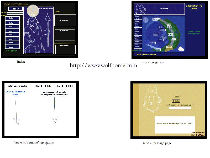
Sorry for colour drainage. GIF = death. I will start off by saying that, unlike the other two sites in this assignment, Wolfhome has absolutely no consistency and will more than likely lose a first time user in navigation. To be fair, this site was designed and released in 1999 when, apparently, people failed at page-by-page navigation. Every page for itself? Anyway, Wolfhome takes advantage of dark colours most of the time. Navy is the preferred background colour on most pages. Yellow is the colour for all important texts, links are blue, most other text is black on white or white on black/dark blue.
The first panel shows the index page which has the title, a login prompt, some short navigational links that won't actually get you anywhere but the forums unless you're logged in, the "guardian" (wolf in a loin cloth) image, and beside him, a small updates box. Above the updates is a statement of how many users are currently online chatting.
The second panel shows the "world map", which still looks decently consistent. I was not sure whether I should or shouldn't call the bar on the left side a navigational bar because other navigational links are scattered all over the screen. Basically the navigational links on the left side link out-of-chat and to modifying personal information, and some lead to dead links (due to a site crash, some pages have not been recovered yet). On the map itself are various links positioned by what I believe to be 'div' boxes on certain parts of the image. By clicking these, users enter chat rooms. On the top of the page, there is a banner that says the name Wolfhome and shows the head of the "guardian". Beside the banner in yellow, it shows the administrators currently online in case anyone needs to "howl" them for help. (The option is also available in-chat, though that is an absolutely different interface.)
In the third panel, we see what is known as the "mysts". It is a page for users to view the chat rooms that are occupied and see who is in them. It is plain white with some links at the top. Under a black horizontal bar, the left side has in blue text and hyperlink the names of the chat rooms. On the right side on black text, the alias' of the users in those rooms are displayed. If there is no one in a room, the right side is left blank.
Finally, the last panel contains the "send a message" page where users are able to leave a message for another user to see upon login, and then never again (it is not told by the site to be cached or saved, and does not offer the option). It has almost nothing to do with the other colour schemes or plain appearance with its beige background and side bar. The only consistency with this page is the "guardian" head again. There is a blank text input field to fill in the recipient's name, the message, and then two buttons to send the message or to return to the map view.
For the past seven years, I had been using Wolfhome without thought, but looking at its layout, it is difficult to understand how people are so drawn to such a poorly navigated community.
No comments:
Post a Comment